pythonで四分位点や任意の分位点を計算する方法を3つ紹介します。
概要
今回紹介する方法は下記の3つです。
- np.percentile
- pd.DataFrame.quantile
- pd.DataFrame.describe
データの準備
今回は平均50, 分散10の正規分布からランダムなデータ1000個を取り出したリストを使います。
また、後ろ2つの説明のために、同じデータを使用したデータフレームも準備しておきます。
# np.percentile
np.random.seed(0)
c_list = list(np.random.normal(50, 10, 1000))

c_df = pd.DataFrame({"C1": c_list}) # データフレームの説明用
分布はこのような形になっています。
fig, ax1 = plt.subplots(figsize=(6, 4))
ax2 = ax1.twinx()
sns.distplot(c_list, ax=ax1, kde=False)
sns.distplot(c_list, hist=False, ax=ax2)
ax1.set_xlabel("Value")
ax1.set_ylabel("Count")
ax2.set_ylabel("Density")
ax1.set_xlim(0,100)
ax1.set_title("Histgram of the Data")

参考: https://matplotlib.org/examples/api/two_scales.html
分位点の計算方法
np.percentile
まずはnp.percentileです。
引数のqに、欲しい分位点の位置をパーセント、つまり0~100の間の値で渡します。
c_array = np.percentile(c_list, q=[0, 25, 50, 75, 100])
print(c_array)
得られた結果はこちらです。
[ 19.53856945 43.01579941 49.41971965 56.06950602 77.59355114]
他の2つの方法と違い、データフレームやSeriesを準備しなくて良いのが利点です。
オプションで分位点が二つのデータの間になってしまった場合の計算方法などを指定できます。
その辺りも含め、ドキュメントもご参照ください。

pd.DataFrame.quantile
次はpd.DataFrame.quantileを使用する方法です。ドキュメントはこちらです。
https://pandas.pydata.org/pandas-docs/stable/generated/pandas.DataFrame.quantile.html
こちらは引数のqに欲しい分位点の位置を割合、つまり0~1の間の値で渡します。
早速使って見ましょう。このコードはJupyter Notebook上で実行しています。
c_df.quantile(q=[0, 0.25, 0.5, 0.75, 1])
結果として返ってくるデータフレームがこちらです。
| C1 | |
|---|---|
| 0.00 | 19.538569 |
| 0.25 | 43.015799 |
| 0.50 | 49.419720 |
| 0.75 | 56.069506 |
| 1.00 | 77.593551 |
pd.DataFrame.quantileを使用する大きなメリットは、データフレーム全体に適用できることです。
例えば、scikit-learnのload_bostonで準備したデータセットに対してこの方法を使って見ましょう。
参考: https://scikit-learn.org/stable/modules/generated/sklearn.datasets.load_boston.html
データフレームはboston_dfという名前で準備しています。
本題から外れるので、準備部分に興味がある場合はこちらを参照してください。
https://bunsekikobako.com/sklearn-datasets_import_load_boston/
boston_df.quantile(q=[0, 0.25, 0.5, 0.75, 1])
結果はこちらです。
| CRIM | ZN | INDUS | CHAS | NOX | RM | AGE | DIS | RAD | TAX | PTRATIO | B | LSTAT | |
|---|---|---|---|---|---|---|---|---|---|---|---|---|---|
| 0.00 | 0.006320 | 0.0 | 0.46 | 0.0 | 0.385 | 3.5610 | 2.900 | 1.129600 | 1.0 | 187.0 | 12.60 | 0.3200 | 1.730 |
| 0.25 | 0.082045 | 0.0 | 5.19 | 0.0 | 0.449 | 5.8855 | 45.025 | 2.100175 | 4.0 | 279.0 | 17.40 | 375.3775 | 6.950 |
| 0.50 | 0.256510 | 0.0 | 9.69 | 0.0 | 0.538 | 6.2085 | 77.500 | 3.207450 | 5.0 | 330.0 | 19.05 | 391.4400 | 11.360 |
| 0.75 | 3.647423 | 12.5 | 18.10 | 0.0 | 0.624 | 6.6235 | 94.075 | 5.188425 | 24.0 | 666.0 | 20.20 | 396.2250 | 16.955 |
| 1.00 | 88.976200 | 100.0 | 27.74 | 1.0 | 0.871 | 8.7800 | 100.000 | 12.126500 | 24.0 | 711.0 | 22.00 | 396.9000 | 37.970 |
また、DataFrameではなく、Seriesにも適用可能です。
c_df["C1"] .quantile(q=[0, 0.25, 0.5, 0.75, 1])
これにより、以下のような結果が得られます。
0.00 19.538569
0.25 43.015799
0.50 49.419720
0.75 56.069506
1.00 77.593551
Name: C1, dtype: float64
pd.DataFrame.describe
最後に、describeを使用した方法です。ドキュメントはこちら。
https://pandas.pydata.org/pandas-docs/stable/generated/pandas.DataFrame.describe.html
describeは引数なしで使うことも多いと思います。その例がこちらです。
c_df.describe()
| C1 | |
|---|---|
| count | 1000.000000 |
| mean | 49.547433 |
| std | 9.875270 |
| min | 19.538569 |
| 25% | 43.015799 |
| 50% | 49.419720 |
| 75% | 56.069506 |
| max | 77.593551 |
統計量をまとめて取れるのが強みですね。
引数なしでも非常に有用ですが、describeはいくつか引数を取ることができます。
そのうちの一つがpercentileです。この引数には割合、つまり0~1の値を与えます。
percentileはデフォルトが[.25, .5, .75]になっています。
まずはデフォルトでの使用例です。必要な情報だけを出力するように.locを入れています。
use_cols = ["min", "25%","50%", "75%","max"]
c_df.describe().loc[use_cols,:]
| C1 | |
|---|---|
| min | 19.538569 |
| 25% | 43.015799 |
| 50% | 49.419720 |
| 75% | 56.069506 |
| max | 77.593551 |
次に、下位10%、上位10%も入れてみます。
percentile_list = [.1, .25, .5, .75, .9]
use_cols = ["min", "10%", "25%","50%", "75%","90%", "max"]
c_df.describe(percentile_list).loc[use_cols,:]
| C1 | |
|---|---|
| min | 19.538569 |
| 10% | 37.008577 |
| 25% | 43.015799 |
| 50% | 49.419720 |
| 75% | 56.069506 |
| 90% | 62.315936 |
| max | 77.593551 |
もちろん、pandas.Seriesにも使用することができます。
percentile_list = [.1, .25, .5, .75, .9]
use_cols = ["min", "10%", "25%","50%", "75%","90%", "max"]
c_df["C1"].describe(percentile_list).loc[use_cols]
出力結果はこちらです。
min 19.538569
10% 37.008577
25% 43.015799
50% 49.419720
75% 56.069506
90% 62.315936
max 77.593551
Name: C1, dtype: float64
分位点をヒストグラムに描画する
最後に、得られた結果をヒストグラムに描画してみます。
今回はリストのデータだったので、一番手軽なnp.percentileを使用した方法です。
quantile_array = np.percentile(c_list, q=[25, 50, 75])

fig, ax1 = plt.subplots(figsize=(6, 4))
ax2 = ax1.twinx()
sns.distplot(c_list, ax=ax1, kde=False)
sns.distplot(c_list, hist=False, ax=ax2)
ax1.set_xlabel("Value")
ax1.set_ylabel("Count")
ax2.set_ylabel("Density")
ax1.set_xlim(0,100)
ax1.set_title("Histgram of the Data")

vmin, vmax = ax1.get_ylim()

for each in quantile_array:
ax1.vlines(each, vmin-1, vmax+1)
ax1.set_ylim([vmin, vmax]);
描画結果はこのようになります。
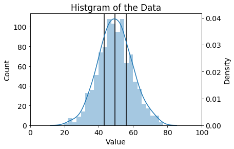
あまり工夫はありませんが、グラフ内の縦の黒線が
第1四分位点、第2四分位点、第3四分位点の位置を示しています。
まとめ
numpy, pandasを使用して分位点を計算する方法を紹介しました。
時々使うことがあるので、自分が使いやすい方法を覚えておくと良いかと思います。
参考資料
https://matplotlib.org/examples/api/two_scales.html
https://docs.scipy.org/doc/numpy-1.15.0/reference/generated/numpy.percentile.html
https://pandas.pydata.org/pandas-docs/stable/generated/pandas.DataFrame.quantile.html
https://seaborn.pydata.org/generated/seaborn.distplot.html
https://pandas.pydata.org/pandas-docs/stable/generated/pandas.DataFrame.describe.html
https://scikit-learn.org/stable/modules/generated/sklearn.datasets.load_boston.html
https://stackoverflow.com/questions/45926230/how-to-calculate-1st-and-3rd-quartiles
https://bunsekikobako.com/sklearn-datasets_import_load_boston/